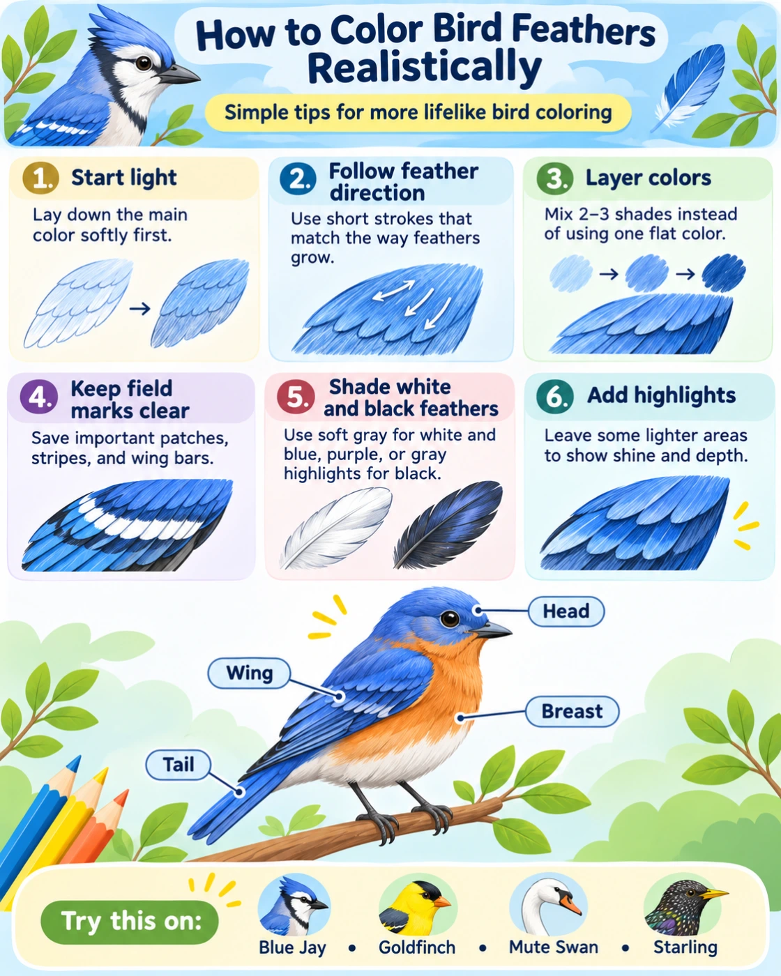
Realistic bird coloring is not about drawing every feather one by one. The most convincing results usually come from noticing the direction of the feathers, using several shades instead of one flat color, and keeping the bird’s natural markings in the right places.
A simple coloring page can look surprisingly lifelike with only a few pencils and a little patience.
Start with the bird’s real colors
Before coloring, look at a photo or natural color guide for the species.
Try to identify the main color areas first. A bird may look simply brown, gray, black, or white from a distance, but closer inspection often reveals several different shades.
A Common Chaffinch, for example, combines blue-gray, chestnut, pinkish brown, black, white, and olive tones. A Blue Jay uses blue, black, white, and gray in very different parts of the plumage.
Do not worry about tiny details yet. Begin by understanding the bird’s overall color pattern.
Color the largest areas first
Start with broad areas such as the back, breast, head, wings, and tail.
Use a light layer of color rather than pressing hard immediately. This makes it easier to add darker shades later and creates a softer feathered appearance.
Work from light to dark.
For example, if the breast is warm brown, begin with a light tan or beige. Add darker brown only where shadows or stronger markings appear.
Follow the direction of the feathers
One of the easiest ways to make a bird look more realistic is to move the pencil in the same direction as the feathers.
On the breast, feathers often overlap downward.
On the wings, longer feathers usually follow the direction of the wing.
On the tail, strokes should generally follow the length of the tail feathers.
Short, controlled pencil strokes can suggest feather texture without requiring you to draw every feather separately.
Think in feather groups
Bird plumage is divided into different groups of feathers.
Instead of trying to color hundreds of individual feathers, look at larger sections such as the head, back, wing coverts, flight feathers, breast, and tail.
Each group can have its own direction, texture, or shade.
This makes the bird easier to color and usually creates a more natural result than filling the entire body with the same texture.
Use more than one shade
Real feathers rarely look like one completely flat color.
A brown bird may contain warm brown, gray-brown, cream, and almost black areas. A gray bird may include blue-gray, warm gray, and pale silver tones.
Try layering two or three related colors.
Begin with the lightest shade, then add a medium tone, and finally use the darkest color for shadows, markings, and deeper feather edges.
This works especially well with colored pencils.
Do not use pure black everywhere
Black birds are a good example of why realistic coloring needs more than one color.
A Rook or Eurasian Jackdaw may appear black, but its feathers can reflect blue, purple, green, or gray depending on the light.
Start with dark gray, deep blue, or dark brown and gradually add black.
Leave some areas slightly lighter to suggest reflections and feather texture.
This usually looks more realistic than filling the entire bird with solid black.
Add color to white feathers
White birds are not simply blank paper.
A Mute Swan may have white plumage, but shadows can appear pale gray, blue-gray, cream, or very soft beige.
Keep most of the feather area white and add gentle shading beneath wings, around the neck, or where feathers overlap.
Use very light pressure.
Too much gray can quickly make white plumage look dirty rather than shaded.
Pay attention to the wings
Wings often contain the most detailed feather patterns.
Look for wing bars, pale edges, spots, patches, and differences between shorter feathers and long flight feathers.
A European Goldfinch has a bright yellow wing band.
A Eurasian Jay has a blue-and-black barred patch.
A Blue Jay has a combination of blue, black, and white patterns.
Color these distinctive markings carefully because they are often important field marks as well as beautiful details.
Make the breast softer than the wings
Feathers on the breast and belly usually look softer and fluffier than the long, structured feathers of the wings and tail.
Use shorter, lighter strokes on the breast.
On the wings and tail, use longer and more directional strokes.
Changing the texture between different parts of the bird can make the entire picture feel more three-dimensional.
Leave some highlights
Do not color every area with the same pressure.
Small lighter areas can suggest light reflecting from the feathers.
This is especially useful on glossy heads, dark wings, and iridescent plumage.
Leave some of the paper visible or use a very pale shade in the brightest areas.
The contrast between light and dark often creates more realism than adding extra detail.
How to color iridescent feathers
Some birds appear to change color depending on the angle of the light.
European Starlings can show green and purple reflections. Rooks may show blue and violet. Mallard drakes have glossy green heads.
Do not try to cover the whole area with these bright colors.
Start with the main dark base color and add small areas of blue, green, purple, or turquoise where the light would catch the feathers.
Keep these colors subtle.
Iridescence usually works best as a highlight rather than the main color.
Use darker color where feathers overlap
Feathers create small shadows where one layer overlaps another.
You can suggest this by adding slightly darker color along some feather edges.
Avoid outlining every feather heavily.
A few darker areas are usually enough to create depth.
This technique works particularly well on wings, where layers of feathers are easy to see.
Keep important field marks clear
Realistic shading should not hide the markings that identify the species.
If the bird has a white cheek, yellow wing bar, black eye stripe, red crown, or spotted breast, keep those areas easy to see.
For example, the Great Tit should still have clearly defined white cheeks and a dark stripe down the yellow underside.
The Northern Cardinal should keep its black face mask.
The European Goldfinch should keep its red face and bright yellow wing stripe.
These markings are often more important than tiny feather details.
Use colored pencils in layers
Colored pencils are especially useful for realistic bird coloring because they allow you to build color gradually.
Begin with light pressure.
Add several thin layers rather than one heavy layer.
Use a second color over the first to create more natural shades.
For example, brown plumage can be built from beige, ochre, reddish brown, dark brown, and gray.
You do not need a large pencil set. Careful layering can create many different colors from a small number of pencils.
Try a simple three-layer method
A useful beginner technique is to work in three stages.
First, add the light base color.
Second, add the main feather color using strokes that follow the plumage.
Third, add darker shadows and important markings.
Stop before the page becomes too dark.
It is usually easier to add more color than to remove it.
Look at the whole bird regularly
It is easy to focus on one wing or one patch of feathers for too long.
Every few minutes, look at the entire bird.
Ask whether the head, breast, wings, and tail still look balanced.
Some areas should be detailed, while others can remain simple.
Realistic coloring does not mean every part of the picture needs the same amount of detail.
Practice with different kinds of birds
Different species are useful for practicing different coloring techniques.
A Mute Swan is good for learning subtle shading on white feathers.
A Rook is useful for practicing dark glossy plumage.
A Common Pheasant offers many warm colors and detailed patterns.
A European Goldfinch is good for practicing strong contrasting markings.
A Blue Jay combines layered blue tones with black-and-white patterns.
Trying different species helps you learn how varied bird plumage can be.
Realistic does not mean perfect
There is no need to copy every color exactly.
Photographs can show the same bird differently depending on light, age, sex, season, and individual variation.
Focus on the main colors and recognizable field marks.
If the bird still looks like the species you intended to color, the most important part is already working.
Color, observe, and look again
Realistic bird coloring becomes easier when you start looking at birds more carefully.
Notice how feathers overlap, where shadows appear, which colors are brightest, and which markings make the species recognizable.
Then use those observations on the coloring page.
The more birds you color, the easier it becomes to see that feathers are not simply brown, black, white, or blue. They are layers of color, light, pattern, and texture—and that is what makes them so interesting to color.